Buchstabenmuseum Berlin (Typography Museum) – 1000 letters over 1000 square meters

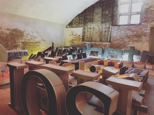
The director of the Buchstabenmuseum Berlin (Typography Museum), Barbara Dechant, was so kind to let me take a look at their new premises under the S-Bahn station ‘Bellevue’. The museum is currently closed to the public, whilst negotiations for a new contract with the owner of the location, the Deutsche Bahn, are ongoing. In the meantime, their exhibits have found a safe haven – 1000 letters over 1000 square meters. The motto of the Buchstabenmuseum is “Bewahrung und Dokumentation von Buchstaben” (‘The Preservation and Documentation of Letters’).
Here are some interesting examples of letters and logos that I discovered in their treasure trove:
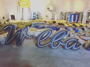
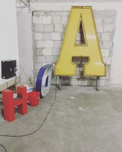
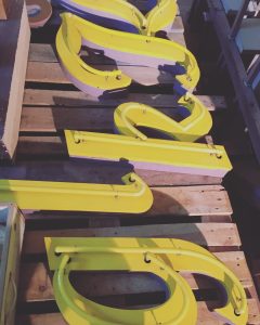
German fashion/textile brand Ebbinghaus, in business since 1945, closed its doors in 2012
The Ebbinghaus letters weigh 150 kilograms each
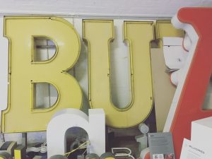
Use of yellow on yellow an interesting feature
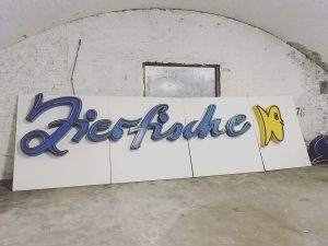
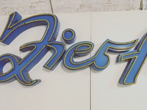
The logo of aquarium shop ‘Zierfische’, located at Karl-Marx-Allee during GDR times – a very prominent location in the 1980s
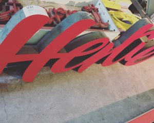
The West-German department store Hertie (Waren- und Kaufhaus GmbH) was bought up in 1994
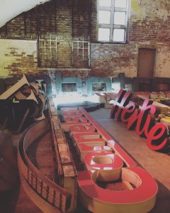
‘Hertie’ – a funeral orchestra played when the company logo was taken down
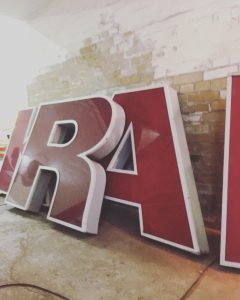
In 1907, the AEG (Allgemeine Elektricitäts-Gesellschaft) typeface and logo were designed by Peter Behrens, a German architect, designer and typographer
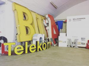
Behrens invented Corporate Design – all AEG products would from hereon carry the same logo
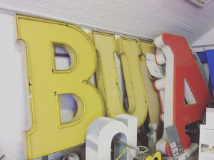
The red letter A can be seen in the corner
Behrens also had his own architecture company, and employed some of Germany’s most famous modern architects, including Walter Gropius, Le Corbusier and Ludwig Mies van der Rohe
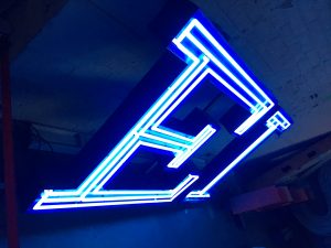
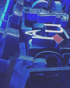
Super sensitive glass tubes
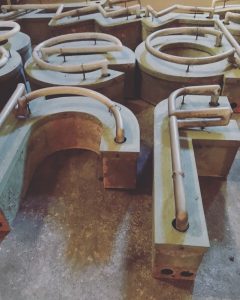
All handmade tubes
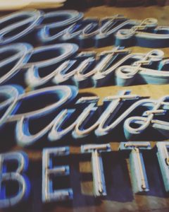
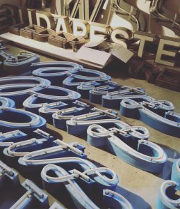
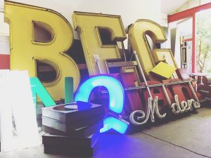
A lot of the times, a shop’s or company‘s logo was handwritten
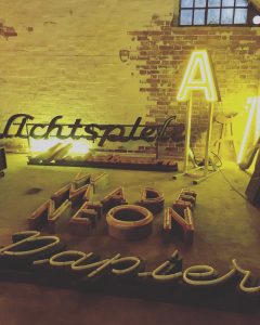
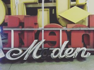
Supermarket Reichelt on one side, Moden (Fashion) logo on the other
Reflecting back on my visit to the Buchstabenmuseum, it occurs to me that it truly is an urban archive of its own kind, and as such (collecting and maintaining large and small letters as well as logos) most likely the only one in the world.
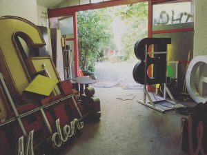
Staff at the Buchstabenmuseum are friendly and passionate about the museum and its history and future.
The passion that the staff of the museum have for its history, present and future is impressive. The letters and logos are being stored there to keep them from being thrown onto the dust heap of history. Some of the logos belong to companies that are no longer in existence, both West and East German ones, and have been rescued by people who care about them being in the world, as a reminder of times gone by, but also as objects in their own right. It truly is a museum now. The handmade letters and handwritten logos look like straight out of another time, standing out in appearance and design in today’s world. Once upon a time, they were looked upon as being progressive and technologically advanced (ie the AEG letters and the conception of the idea of a coherent font and look for the company and its products).
The S-Bahn trains run above the 1000 square meter storage space every 3 minutes, and gives the visit to the museum an eerie feeling. A weird and wonderful world all of its own, oblivious of time passing by. You could imagine someone opening the door to the space in a hundred years time and discover these all over again, like symbols of an even further along lost time.
